When creating digital content for students or the general population, it is important, sometime even the law, to ensure that it is accessible to everyone. There are many way in which you can alter your digital content to be accessible to those around you.
One of the easiest ways to ensure that your content is accessible, and one that I feel is overlooked, by ensuring that you are using colours that everyone will be able to perceive. I feel that many people forget that while content should look aesthetically pleasing to the eye, it is also important to create something that everyone can see with little strain to their eyes. If you are creating a website, you can check you site using a colour contrast checker. In the classroom that I work in on Wednesdays, there is a student who is red-green colour blind. Meaning that when he looks at the picture below, he cannot read the numbers in the coloured circle.
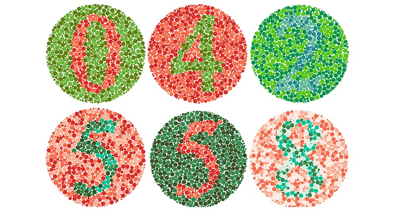
To help him and others who are colour blind or struggle to see colours, it is important to use colours and fonts with high contrast. If I decided to change my text colour to a grey, it would be very difficult to read because there would be very little contrast between the background and the text. So making sure that you are using forms of media that have large colour contrast will help the people viewing your work. Learning different ways to accommodate colour blindness in the classroom, both using media and in everyday tasks, is something that I would love to talk to other teachers about.
Another way to help create an assessable form of media is to have photos with alternative text. This means that along with the visual photo, there is a text description that will be read aloud by a screen reader if someone who is visually impaired is listening to the media you have created instead of reading it. Also, this is a useful tool for when the photo cannot load because the alternative text will appear when the photo is not visible. This is something that I did not know was a possibility, and I will start using alt-text more often.
Example of an accessible photo

One of the most important things to do when creating accessible content is to ensure that there are different ways students can view video footage. Making sure that there is video and audio when using a YouTube video or another site ensures that the content is accessible to everyone. Putting the subtitles option for students who are hard of hearing, are not able to listen to the video, or who do not speak English as their fist language, will allow them to still enjoy the content. I know that I appreciate having subtitles when watching a video to help me focus and absorb what is being said.
Great reflection Maya! I agree with what you said about making videos accessible to everyone – there are so many different reasons someone may not be able to understand a video. I love the example photo you chose to highlight red/green colour blindness. I also really liked the way you broke up your reflection between photos and text blocks – it is very visually appealing and makes it an easier read. I wonder if you could add some colour to the hyperlink to make it stand out more?